Home
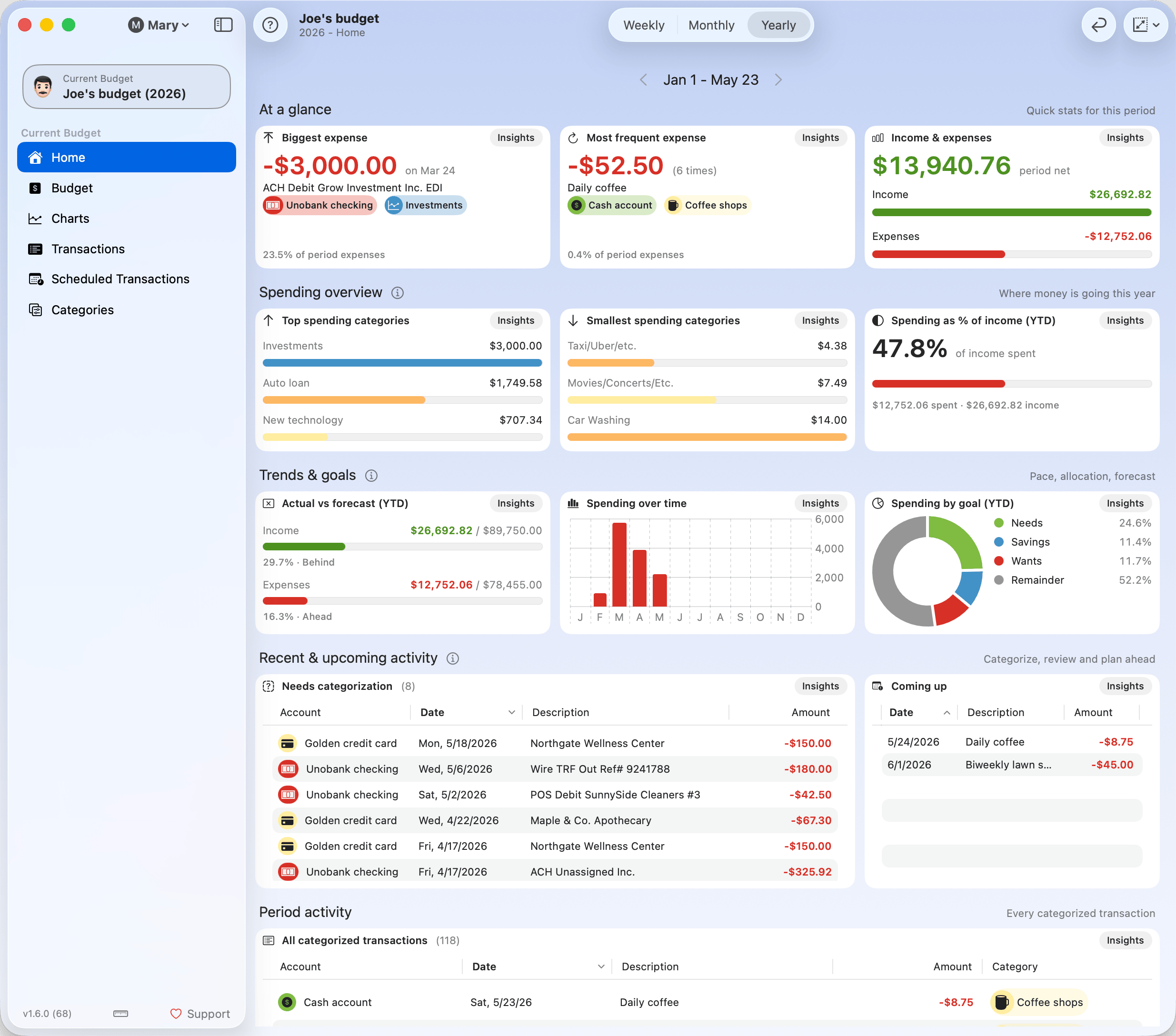
The Home dashboard provides a consolidated overview of your budget activity, highlighting the most relevant financial insights for the selected time period. It includes visual summaries of income, expenses, forecasts, and transactions—offering a quick snapshot of your financial health. Clicking on any widget Insights button shows even more insights, with fully interactive charts, expanded details to category or transaction level, and much more. See Widget Insights for the full list.
Note: Some widgets adapt to the period selected.
Toolbar

Time Period Navigation
Use this control to switch between Weekly, Monthly, and Yearly views. All widgets will automatically update to reflect data for the selected period. You can also navigate through time using the arrows next to the date label.


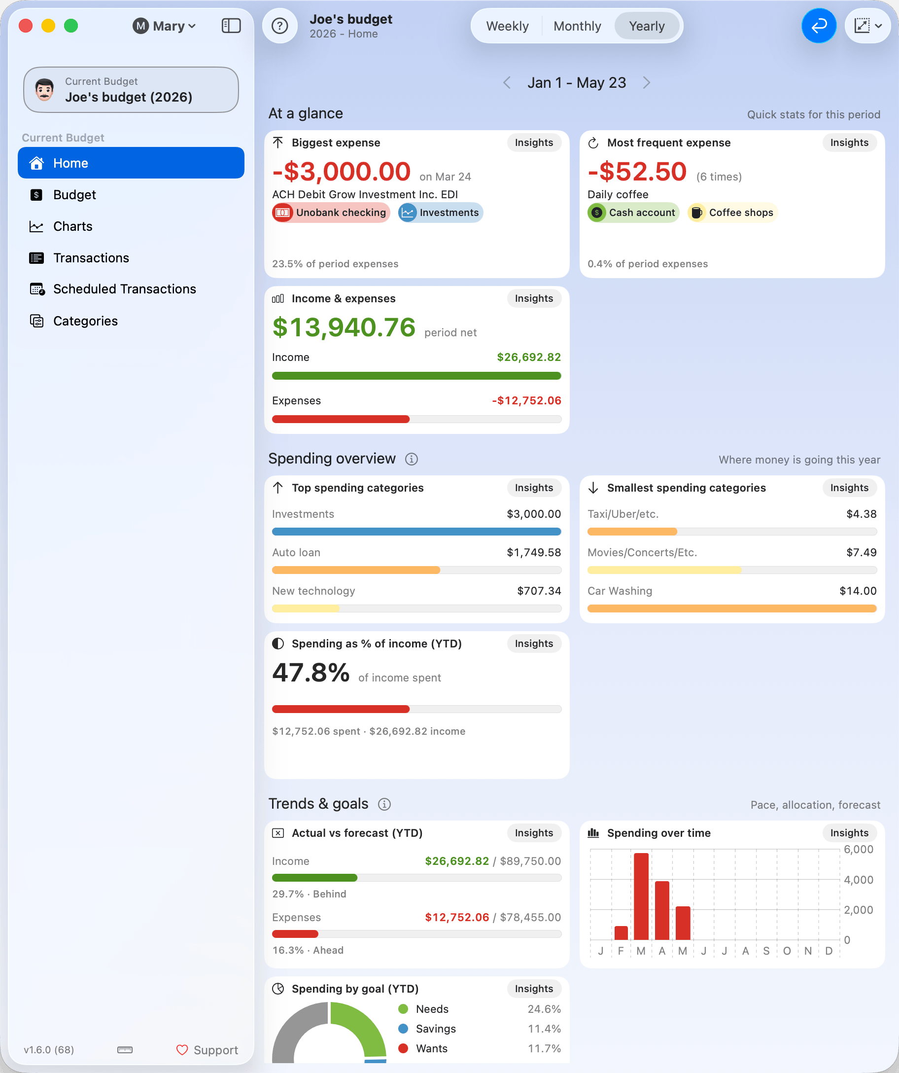
Dashboard Reflow
You can turn this option on to wrap all widgets according to the current window width. It helps avoid horizontal scrolling in narrow windows. The image below shows the effect of applying the reflow.
Max Widget Size
This setting controls how large widgets can grow when you resize the window. They will expand up to the specified size, improving readability and layout flow.
Available sizes: Small, Regular, Medium, Large, Extra-large.
Widgets
Widgets are not configurable but are automatically updated when you change the selected time period. They are organized into 5 sections.
At a glance
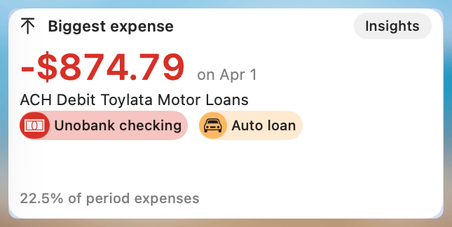
Biggest Expense
Displays the highest single expense transaction within the selected period.
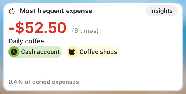
Most Frequent Expense
Identifies the most frequently occurring expense during the selected period.
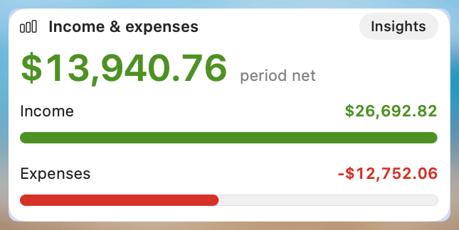
Income and Expenses
Helps compare income and expenses for the selected period.
See full chart: Category Breakdown
Spending overview
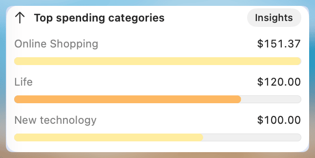
Top Spending Categories
Aggregates and displays the top 3 categories with the highest total expenses.
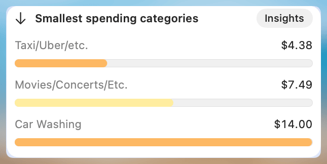
Smallest Spending Categories
Displays the 3 categories with the lowest total expenses—useful for identifying overlooked or underused categories.
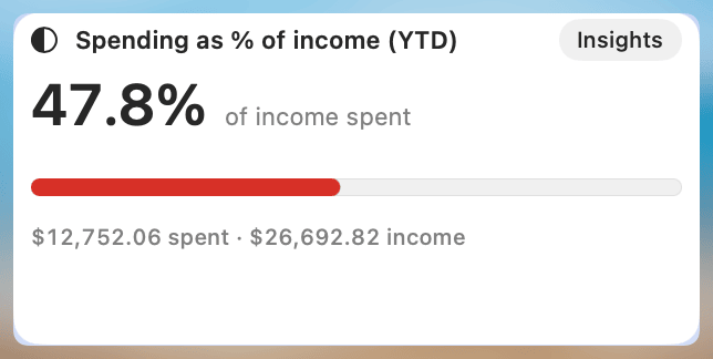
Spending as % of income (YTD)
Presents a year-to-date comparison of total income versus total expenses. Helpful for tracking your overall financial balance.
See full chart: Spending as % of Income
Trends & goals
Actual vs Forecast (YTD)
Compares actual income and expense totals to your forecasted values, year-to-date.
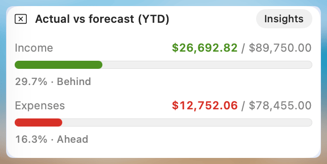
See full chart: Actual vs Forecast
Spending over time
Shows a simplified bar chart of how expenses are distributed over time. While categories aren’t individually shown, the chart is useful for spotting patterns and spikes. The frequency changes based on the selected time range.
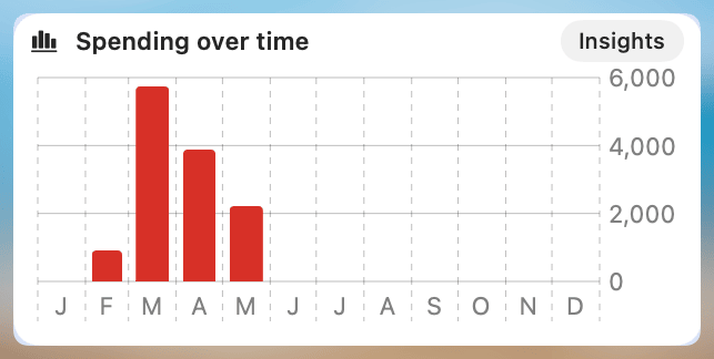
See full chart: Category Timeline
Spending by goal (YTD)
Displays a preview of your Budget Goal allocations (e.g. Needs, Wants, Savings) and how actual spending aligns with target percentages.
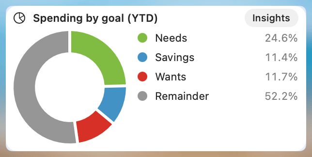
See full chart: Totals by Goal
Note: If there isn’t enough data (e.g. early in the year), the widget may display a warning.
Recent & upcoming activity
Needs categorization
Lists any transactions—typically imported—that have not yet been categorized. Useful for quickly addressing missing data.
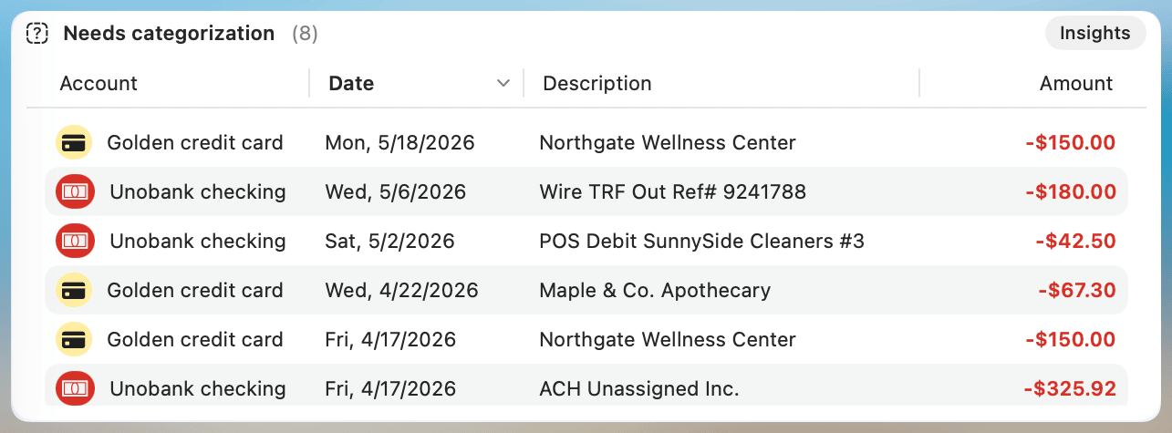
Click any column header to sort the list by that column; click again to reverse the order. The sort order isn't saved between launches — the widget always opens with its default sort.
Coming up
Lists all scheduled transactions expected to occur soon.
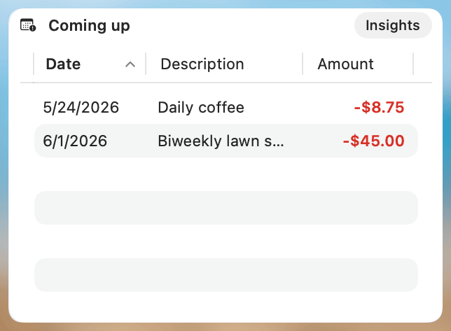
Click any column header to sort the list by that column; click again to reverse the order. The sort order isn't saved between launches — the widget always opens with its default sort.
Period activity
All categorized transactions
Shows a list of all categorized transactions for the selected period.
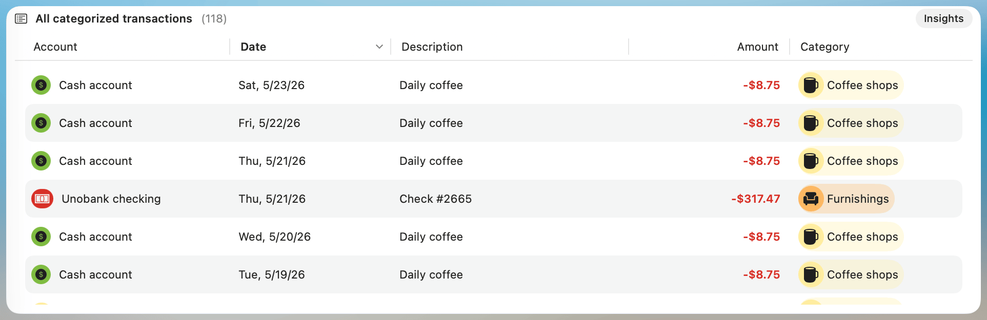
Click any column header to sort the list by that column; click again to reverse the order. The sort order isn't saved between launches — the widget always opens with its default sort.