Actual vs Expected
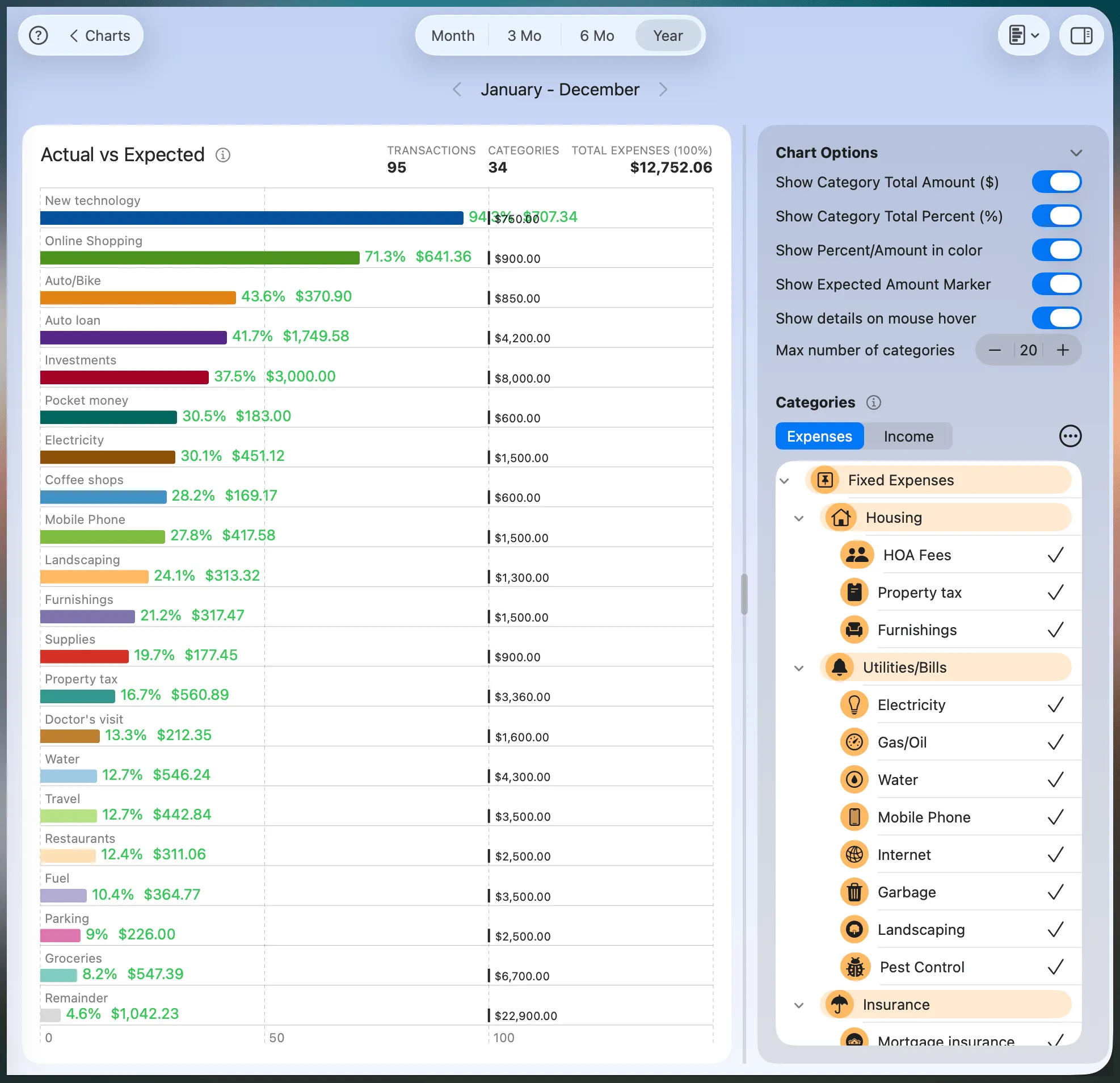
The Actual vs Expected chart compares your year-to-date actual spending against the expected amount you set for each selected category (a fixed budget or an adjustable forecast). This view helps you quickly identify whether you’re under, on track, or over your expected amounts.
Each bar displays the percentage of your expected amount that’s already been spent, as well as the actual amount and the expected amount. This chart is especially useful for keeping your long-term spending in check and adjusting your expected amounts as needed.
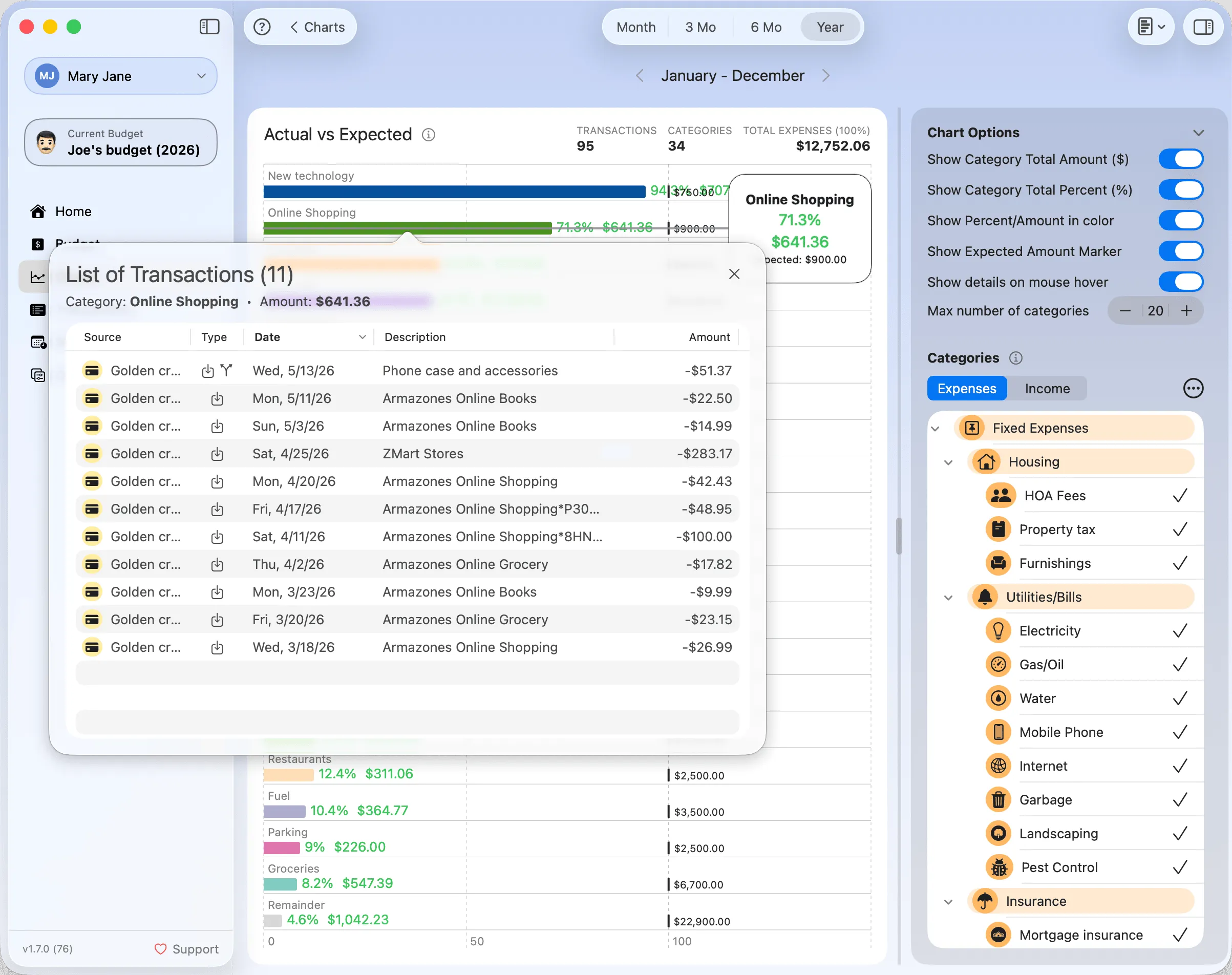
Hovering over each bar displays a balloon with more details. Clicking on any bar shows a list of transactions behind that amount.
The gray Remainder bar represents the combined value of categories not currently shown, ensuring the chart always reflects 100% of the actual total.
Use this chart to spot categories where you consistently overspend and may need to revise your expected amount—or where you're underspending and can reallocate funds.
Chart Options
Show Category Total Amount ($): Displays the actual YTD amount spent directly on the bar.
Show Category Total Percent (%): Shows the percentage of the expected amount that has been spent so far.
Show Percent/Amount in color: Highlights actual percentages and amounts in color for quick visual distinction.
Show Expected Amount Marker: Adds a marker on the chart to indicate the expected amount, helping you compare actual performance at a glance.
Show details on mouse hover: Enables tooltips when hovering over bars, showing the category name, percent spent, actual total, and expected amount.
Max number of categories: Limits how many categories appear in the chart. The most relevant ones are shown first based on actual spending.
Categories
Use the Categories panel to include or exclude specific categories from the chart. Only categories with an expected amount are eligible to appear.
Expenses/Income
Toggle between Expense and Income tabs to adjust which types of categories are displayed. Both groups are supported.
Category list: Check or uncheck specific categories to include/exclude them from the chart. Subcategories follow the budget hierarchy and can be selected independently.
Shortcut buttons:
- Top arrow: Selects all top-level categories.
- Bottom arrow (default): Selects all subcategories.
- Up arrow: Selects the parent level of the current selection.
- Down arrow: Selects the immediate subcategories.
All preferences are saved per chart and automatically restored the next time you return.