Table of Contents
Overview
OnboardingHome
Budget
Charts
-
Charts
Transactions by Category
Transactions Timeline
Income/Expense Ratio
Actual vs Forecast Performance (YTD)
Totals by Category Group
Transactions
-
Transactions
Add Manual Transaction
Edit Manual Transaction
Edit Imported Transaction
Assign Transactions
Split Transaction
Scheduled Transactions
Categories
Frequently Asked QuestionsKnown Issues
Charts
The Charts screen provides a visual summary of your budget performance, helping you analyze transactions, income, and spending trends over time. It includes multiple charts, each offering a different perspective to support better financial decisions.
Each chart focuses on specific insights—from total spending by category to your progress toward forecast targets. You can explore them by clicking any chart to open a detailed view with filters and customization options.
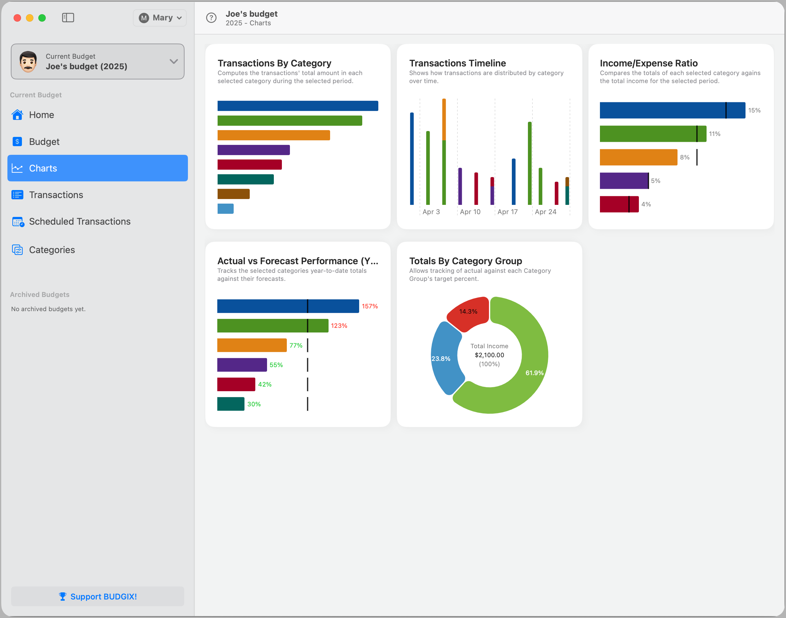
Transactions by Category
Displays a bar chart of total transaction amounts by category for the selected time period. This chart helps you quickly see where most of your money is going and optionally compare results against your category targets.
Transactions Timeline
Visualizes how transactions are distributed over time, grouped by category. This view helps identify patterns or unexpected spikes across the selected period.
Income/Expense Ratio
Compares each category’s total to your overall income for the selected period. This ratio helps you understand where your income is going and how each category contributes to your total expenses.
Actual vs Forecast Performance
Shows how your actual year-to-date values compare against your forecast amounts. This view highlights categories where you’re overspending, underspending, or right on track.
Totals by Category Group
Displays how your actual totals compare against the target percentages defined in your Category Groups (e.g. Needs, Wants, Savings). Clicking on a group provides a further breakdown into its individual categories.
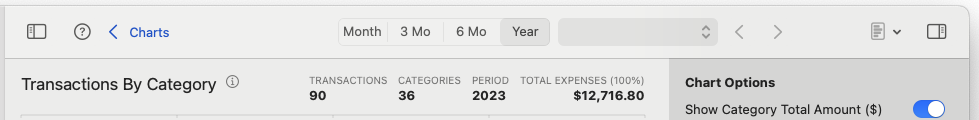
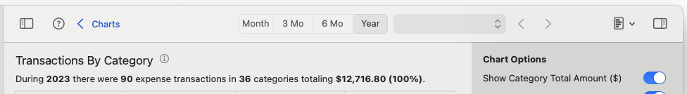
Toolbar
The toolbar at the top of the screen lets you control the time range, navigate between periods, change summary formats, and toggle chart options. Any settings you adjust per chart are remembered and restored the next time you view it.

Time Period Selection and Navigation
View your charts with transactions aggregated by Month, 3 Months, 6 Months, or Year using the time selector.
- Use the dropdown to choose a specific period.
- Use the left/right arrows to move backward or forward in time.
The dropdown content updates based on the selected range:


Chart Summary Header Style
Each chart displays a summary header that provides a quick snapshot of key metrics. You can choose between two display formats:
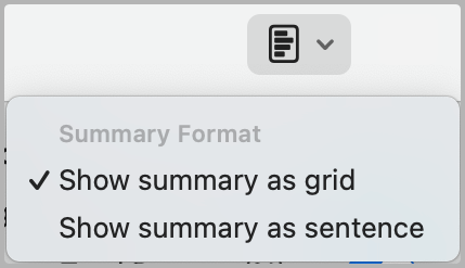
- Show summary as grid: Presents the data in a structured table format.
- Show summary as sentence: Displays the same data in a descriptive sentence format.
Show/Hide Chart Options Panel
Each chart includes a collapsible Chart Options panel on the right. Use it to:
- Toggle value formats (e.g. totals, percentages)
- Filter by category, group, or type
- Adjust other visual/chart-specific settings
The panel is accessed via the icon at the top right. Any changes you make are saved per chart and automatically restored when you return.