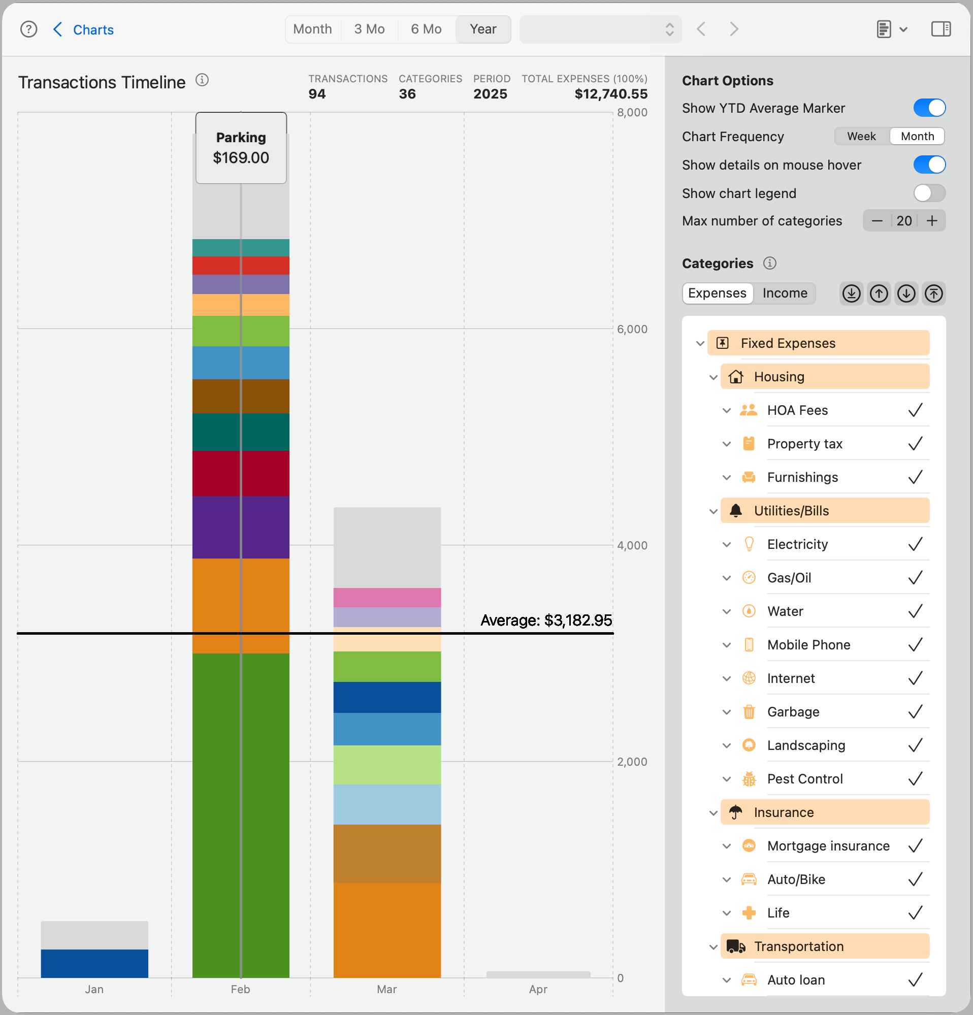
Transactions Timeline
The Transactions Timeline chart shows how your transactions are distributed over time, broken down by category. This view helps you identify spending patterns, spikes, or gaps over a selected period—whether monthly, quarterly, or yearly.
Each vertical stacked bar represents the total for all visible categories on a specific date or time range, depending on the selected frequency. Categories are color-coded for easier comparison, and you can choose how many appear at once.
Note: The timeline adapts to the selected time range in the toolbar—Month, 3 Mo, 6 Mo, or Year—and automatically adjusts the frequency of the data points shown.
Chart Options
Show YTD Average Marker: Displays a horizontal line representing the year-to-date average value across all visible categories. This helps you compare the current period’s activity against long-term behavior.
Chart Frequency: Controls how data is grouped in the timeline—daily, weekly, or monthly—depending on the selected time range. For example, in a 6-month view, monthly grouping may provide a more digestible summary.
Show details on mouse hover: Enables tooltips when hovering over a stacked bar, displaying the category name and transaction amount for that segment.
Show legend: Displays the color-coded legend below the chart, helping you match each color with its corresponding category.
Max number of categories: Sets a limit on how many categories are shown. The highest-value categories are displayed first, stacked from bottom to top.
Note: The gray section labeled Remainder represents the total of all other categories not shown in the visible stack. This keeps the chart focused while still accounting for 100% of the data.
Categories
The Categories panel allows you to select which categories appear in the timeline. As with other charts, you can switch between Expenses and Income, and selectively include or exclude individual categories.
All selections and preferences are saved for this chart and automatically restored the next time you open it.