Income/Expense Ratio
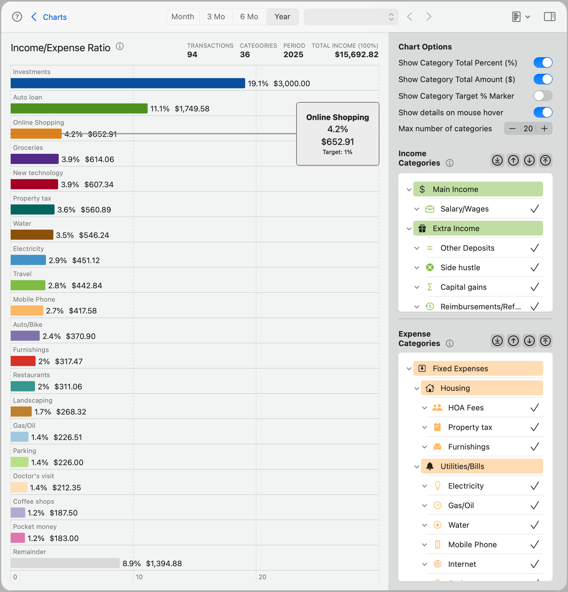
The Income/Expense Ratio chart compares each selected expense category to your total income for the selected period. This helps you understand how much of your income is being consumed by each category and highlights areas that may require closer monitoring.
Each bar represents an expense category, showing both its total amount and its percentage of your overall income. You can optionally include income categories for context and display target percentage markers to evaluate spending against your goals.
Tip: Use this chart to assess whether major spending areas—like housing, subscriptions, or transportation—are taking up a reasonable share of your income.
Chart Options
Show Category Total Percent (%): Displays the percentage of your total income that each expense category represents directly on the bar.
Show Category Total Amount ($): Shows the dollar amount for each category on the bar for more precise comparisons.
Show Category Target % Marker: Adds a visual marker showing the target percentage you've set for a category. This helps you quickly compare actual performance to your intended target.
When used alongside both the percent and amount options, the chart may become visually cluttered—use this feature selectively for best clarity.
Show details on mouse hover: Enables tooltips when hovering over a bar, showing the category name, amount, percentage, and target (if set).
Max number of categories: Limits how many categories appear in the chart. The chart displays the highest-value categories first.
Note: The gray Remainder bar represents the combined value of all other categories not currently shown. This helps maintain a complete picture without overwhelming the chart.
Categories
Use the Income Categories and Expense Categories panels to fine-tune which categories are included in the chart.
Income and Expense Categories
Both groups can be managed independently, and the chart will reflect the selected categories from each.
Category list: Click to include or exclude specific categories. The list follows your existing category hierarchy, and subcategories can be individually selected or deselected.
Shortcut buttons:
- Top arrow: Selects all top-level categories.
- Bottom arrow (default): Selects all subcategories.
- Up arrow: Selects the parent level of the currently selected items.
- Down arrow: Selects the immediate subcategories of the current selection.
All selections and preferences are saved per chart and automatically restored the next time you return.