Transactions by Category
The Transactions by Category chart displays a breakdown of total spending or income by category for the selected period. It helps you quickly understand which categories contribute most to your overall financial activity.
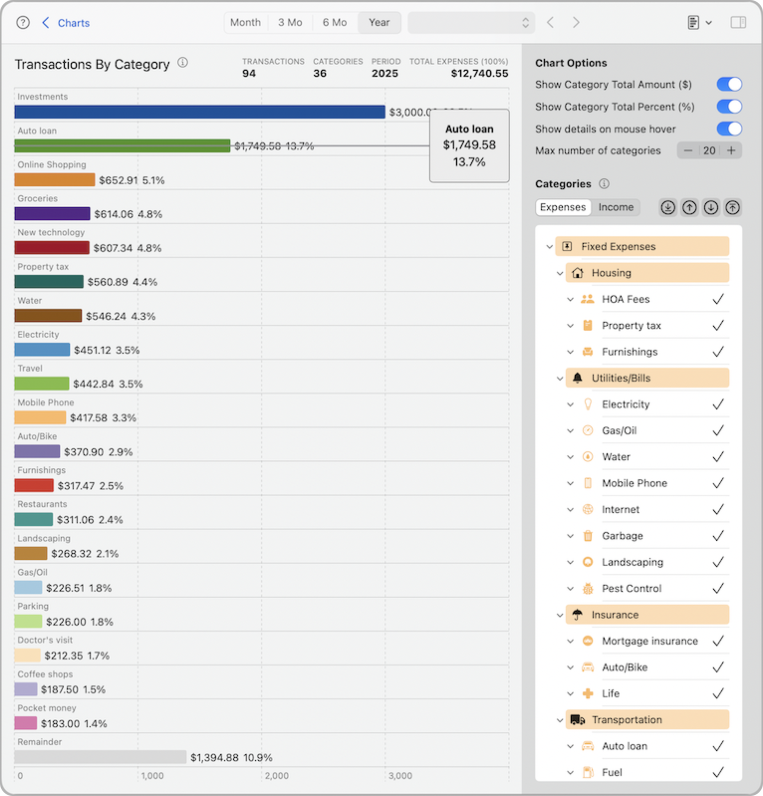
Each selected category is represented by a horizontal bar, sorted from largest to smallest. You can choose to display dollar amounts, percentages, or both. Hovering over a bar shows a tooltip with detailed values. You can also control how many categories appear in the chart.
Note: The gray bar labeled Remainder represents the total of all other categories not currently shown in the chart. This helps keep the chart focused while still accounting for 100% of the data.
All selections and options in this chart—including toggles and selected categories—are saved and automatically restored the next time you return.
Chart Options
Show Category Total Amount ($): Displays the dollar amount directly on each bar.
Show Category Total Percent (%): Shows each category’s percentage of the total amount.
Show details on mouse hover: Enables tooltips showing category name, amount, and percentage when hovering over a bar.
Max number of categories: Limits how many categories appear in the chart. The top categories by value are displayed first. This helps reduce clutter and focus on the most relevant data.
Categories
Use this panel to control which categories are included in the chart. Categories are grouped by Expenses and Income, and you can enable or disable individual categories at any level.
Expenses/Income
Switch between Expense and Income tabs to focus on one type of category at a time. The category list updates accordingly.
Category list: Check or uncheck categories to include or exclude them from the chart. Subcategories are shown under their parent. Changes apply only to this chart.
Shortcut buttons:
Use these buttons to quickly adjust your selections:- Top arrow: Selects all top-level categories.
- Bottom arrow (default): Selects all child categories.
- Up arrow: Selects the parent level of the currently selected categories.
- Down arrow: Selects the immediate subcategories of the current level.
These tools help you efficiently explore your data from different angles. You can also manually check or uncheck categories to fine-tune the view exactly how you want.